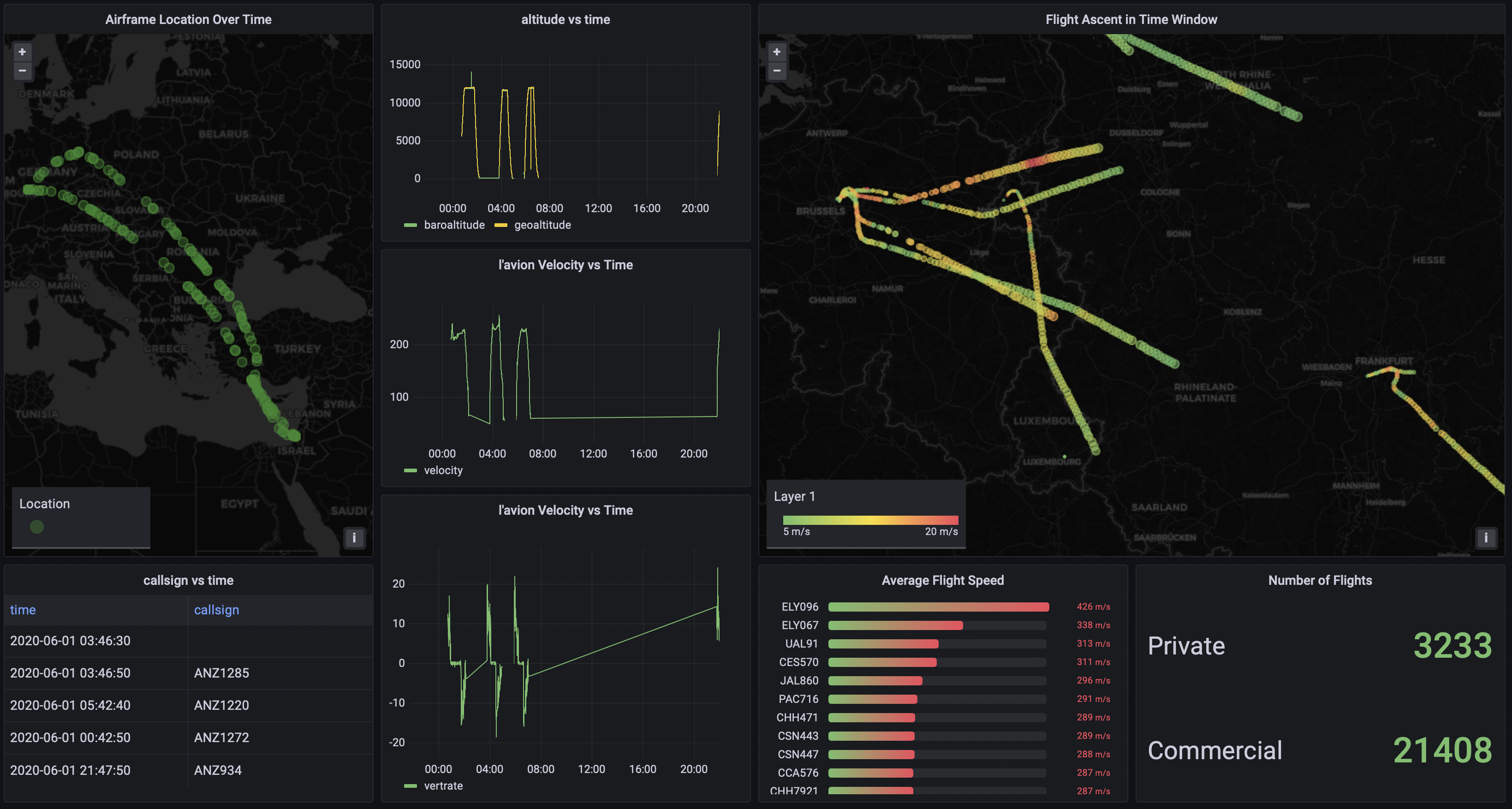
The dashboard, with all the visualizations at the same time, will look like the screenshot below. Here we can continue to extend the dashboards functionality by adding more dynamic variables to have the individual flight data on the left generated with a user query or selection based on the overview take-off information on the right. This is what really empowers decision makers and subject-matter experts (SMEs) to quickly move through data and hone-in on important aspects that may have otherwise been over-looked.